Still experimenting with 'painting'. This is in no way meant to be a tutorial - I'm still trying to work out what to do myself. So if anyone has any tips I'd love to hear them.
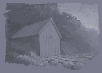
First I took one of my pen sketches from Norway and loosely painted over the top of it using three or four different shades. Sometimes I squinted my eyes to get a stronger contrast and see the modeling more clearly...
I then added a new layer with it's blending mode set to 'color'. This allowed me to tint the value painting underneath...
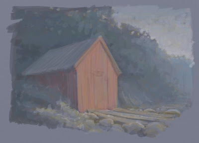
I then added a new layer - without any blending mode - and painted a few more details in - picking colours from the painting with the eyedropper...
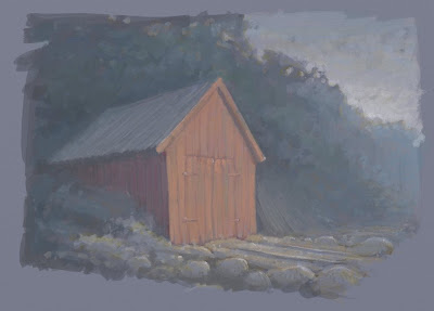
I then took it into photoshop to tweak the levels. Art Rage does have a basic brightness and contrast slider but it's more controllable in PS. I was surprised how lacking in contrast my original painting was. Perhaps I should have painted a scale first...
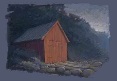
Back in Art Rage I added a few more details - adding the green grass really helped the paiting I think...
Finally I added my favourite rusty metal texture to the topmost layer - blend mode 'Hard Light' and opacity 24%. It adds a bit more texture and varies the colours a bit...
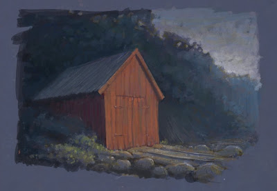
Yesterday I thought the above image was finished but looking at it again today perhaps the colour and contrast could be pushed further - or is it too far?...
Wednesday, January 27, 2010
Friday, January 22, 2010
Brasier repaint
Delage Painted
Thursday, January 21, 2010
Wednesday, January 20, 2010
Art Rage
I've been experimenting with the cheap and cheerful Art Rage software. It's a little like Painter and has some very nice, naturalistic painting and drawing tools. It's perhaps not quite as polished and comprehensive as Painter but in many ways it's much more intuitive. The layers are much easier to use and the palettes cleverly disappear when you draw near them. Here are a few quick doodles. The first are using default brushes and pencils and the last is using a brush I made myself - which is a bit more manageable as it doesn't lay down too much paint. I'm looking forward to trying ot out on a longer piece...
Tuesday, January 12, 2010
How we might drive
I got the chance to design some futuristic racing cars - for a job that hopefully might still happen so I can't say too much about it - other than it was pretty much a dream job for me, Here are a few of the many thumbnail designs I did...
... and some comedy pit robots...
... and finally a few more finished desgns done in photoshop (though I did 'borrow' the hubless wheels from the internet somewhere) The first, my favourite is a slightly retro, Bugatti inspired one...
... and some comedy pit robots...
... and finally a few more finished desgns done in photoshop (though I did 'borrow' the hubless wheels from the internet somewhere) The first, my favourite is a slightly retro, Bugatti inspired one...
Olympic Mascot Designs
Here's another in the series 'jobs that I didn't get or never happened'. I've got quite a lot of stuff in that category - sometimes when you get a run of pitches going down that path you begin to wonder if you're doing something wrong. Then you have to remind yourself that it's not you - it's everyone else who's stupid.
Anyway, earlier in the year I got the chance to pitch some mascot designs for the olympics. I started by doing a few thumbnails and thinking about how these mascots are usually used. They get printed on merchandise and then end up as big foam suits to be worn at promotional events. This is where I think a lot of previous designs which have looked beautiful as 2D designs in print can go terribly wrong so I thought it would be good to design something with this use in mind.
I thought about various themes, landmarks, what makes us British, how do the rest of the world think of us, stereotypes... I decided that the rest of the world think we drink a lot of tea, and it's true, a lot of us do like a cuppa. Also though, I think we like our humour, sometimes silly humour and are very good at laughing at ourselves. This is what I liked about the tea cup idea - it played on a commonly held stereotype and was funny too. I envisioned sporting events for the different cups -'It's a Knockout' style, it would have been great! Pity the judging panel didn't think so. They probably drank tall frappucinos and skinny macchiolatos or something.
Subscribe to:
Posts (Atom)